Frequency Distribution (10 bin)
Tags | |
UUID | ab1bd365-01d8-11e7-9770-bc764e2038f2 |
This vCalc equation takes an input set of data, , and creates a frequency distribution matrix of that data.
The user specifies the boundaries of the possible range of and the range is split into five equal sub-ranges or "bins". The frequency of data values falling between the upper and lower boundary of each bin is then displayed as the frequency distribution.
Inputs
The user inputs into three input fields:
- - a string of data listed as comma-separated values
- Low - Lowest boundary of the data set
- High - Highest boundary of the data set
may be input as integers or real numbers or a mix of the two. Values in must fall between the Low and High Boundaries inclusive. In other words:`"Low" <= X_i <= "High"
The Math
This vCalc equation computes the possible range of defined by the input Low and High values.
"Range"_X = "High" - "Low"`
The equation then splits the range up into 5 equal increments or frequency bins.
The frequency distribution is then computed and the count of data values which fall in each of the five sub-ranges is determined.
A count for each data value is put into the bin if the data value meets the condition:
- value >= bin's lower boundary AND value < bin's upper boundary
A count is added to the top bin if: value = High, the top of the range
Frequency Distribution Example

There are 19 student in the 1st year Algebra Class. They have just taken a test and we will check out how their test scores fall within the possible test score range.
The test score range is Low = 0 to High = 100.
Copy/Paste the following data set into the equation:
98, 90, 92,78, 76, 26, 58, 60, 66, 75, 95, 95, 100, 78, 85, 66, 100, 89, 80
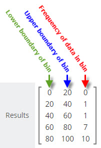
We get back a frequency distribution from vCalc that looks like the example image at the right:
This frequency distribution tells us that there were no values in the frequency bin from 0 to 20, there was one value in the bin range from 20 to 40, there was one value in the bin range from 40 to 60, there were seven values in the bin range from 60 to 80 and there were 10 values in the bin range from 80 to 100.
What Does the Frequency Distribution Tell Us?
The frequency distribution tells us about how the data in a set is distributed. In an easy-to-grasp visual the frequency distribution tells us that a sampled set of data has tendencies to fall in one part or another of a data range.
Our example of test data shows a grouping of most of the values at the top end of the range. Of course, this is you expect to see in a class room led by a competent instructor. The instructor's goal is to help the student maximize their learning experience and the students strive to get high grades, so you would expect the frequency distribution to be skewed toward the upper bins of the grading scale.
If the scores resulting from a test were skewed toward the lower bins, the teacher would know the student were now grasping the lessons for some reason.

Real World Frequency Distributions
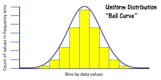
Frequency distributions with real-world data tend to follow a pattern referred to as a "normal distribution". When frequency distributions are applied to unbiased, real world data, you will often see a "normal distribution" or bell-shaped curve. This reflects the tendency of data in nature to cluster around the center of the possible range and taper off in the direction of both the upper and lower bounds.
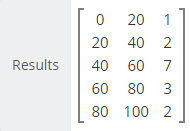
The data example at the right exhibits a somewhat normalized distribution with the center frequency bin showing 7 data values and the data values in the upper and lower bins showing fewer values as we move toward the Lowest and Highest bound of the data range for .

The figure at the left represents a normal distribution. You can see the obvious bell shape of the frequency values represented by the yellow columns.
See Also
- Comments
- Attachments
- Stats
No comments |
