Grades Card Frequency Distribution
Tags | |
UUID | f9ee9ce8-01e2-11e7-9770-bc764e2038f2 |
This vCalc equation takes an input set of grades, , and creates a frequency distribution for the grades. This equation is derived from the more generalized Frequency Distribution equation.
vCalc reports the frequencies in A, B, C, D, F range, where:
The counts of scores for each grade range are displayed as the frequency distribution.
Inputs
The instructor inputs the scores into the input field as comma separated vales. The scored do not have to be ordered.
Grade Distribution Example
In this example, there are 19 student in the class. They have just taken a test and we will check out how their test scores fall within the possible Grade range. We use the typical grading range: 0 to 100.
To follow along with the example, Copy/Paste the following grades into the equation's input field:
98, 90, 92,78, 76, 26, 58, 60, 66, 75, 95, 95, 100, 78, 85, 66, 100, 89, 80
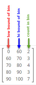
You should see vCalc render the frequency distribution for these grades. The vCalc display should look like the image shown here.
This frequency distribution tells us that:
- there was two failing grades in the bin whose range is from 0 to 60 ( )
- there were three grades in the bin whose range is from 60 to 70 ()
- there were four grades in the bin whose range is from 70 to 80 ()
- there were three grades in the bin whose range is from 80 to 90 ()
- there were seven grades in the bin whose range is from 90 to 100 ().
What Does the Grade Distribution Tell Us?
The frequency distribution for scores tells us about how grades are distributed among a group of students. In an easy-to-grasp visual way the frequency distribution tells us that a classes' grades have a tendency to fall in one part or another of a grading scale.
Our example of test data shows a grouping of most of the values at the top end of the range. Of course, this is what we expect to see in a class room led by an instructor. The instructor's goal is to help the student maximize their learning experience and the students strive to get high grades, so we expect the frequency distribution to be skewed toward the upper bins of the grading scale.
If the scores resulting from testing were skewed toward the grade bins, the instructor would know the student were not grasping the lessons for some reason. From the frequency distribution chart for a classes combined scores over a period of time, the instructor could gain some understanding of how significant the lack of understanding might be.

Real World Frequency Distributions
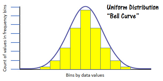
Frequency distributions with real-world data tend to follow a pattern referred to as a "normal distribution". When frequency distributions are applied to unbiased, real world data, you will often see a "normal distribution" or bell-shaped curve. This reflects the tendency of data in nature to cluster around the center of the possible range and taper off in both directions toward the upper and lower bounds of the range.
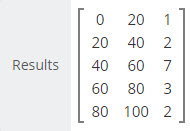
The data example at the right exhibits a somewhat normalized distribution with the center frequency bin showing 7 data values and the data values in the upper and lower bins showing fewer values as we move toward the lowest and highest bound of the data range for .

The figure at the left represents a normal distribution. You can see the obvious bell shape of the frequency values represented by the yellow columns.
See Also
- Comments
- Attachments
- Stats
No comments |
